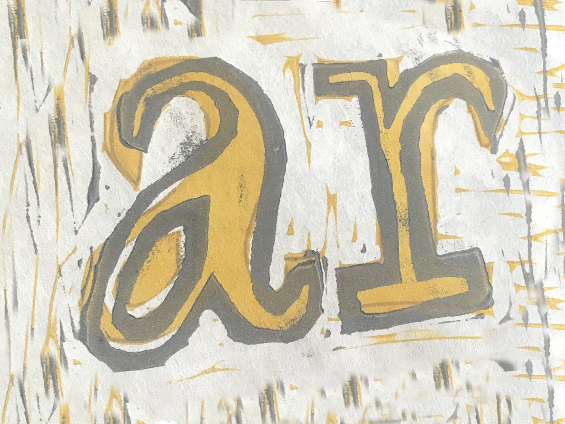
woodcut relief prints
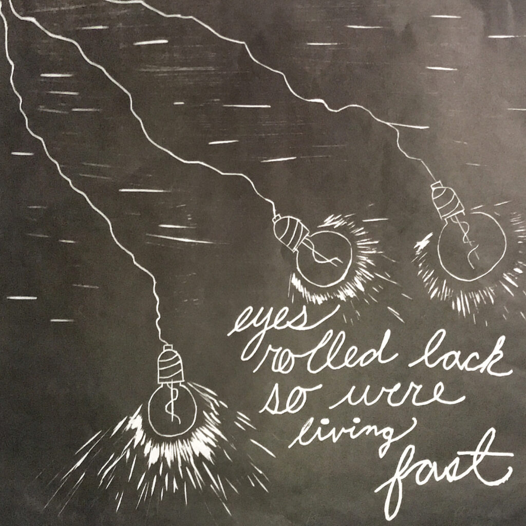
“hold my hand and tell me you’ll stay”-
part one of a diptych that depicts the anxious feelings that one has in the beginning of a relationship, that manifests as unhealthy co-dependency. dremel tool and laser engraver used.
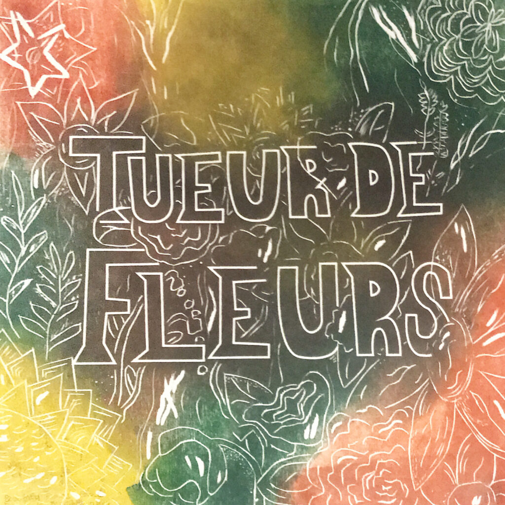
“beautiful things come from a terrible time”-
part two of a diptych showing the irony of the end of a relationship, in that you have to “kill the flowers” in order to move on to something better. juxtaposed by the bright colors. dremel and laser engraver also used.
intaglio
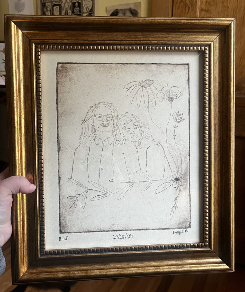
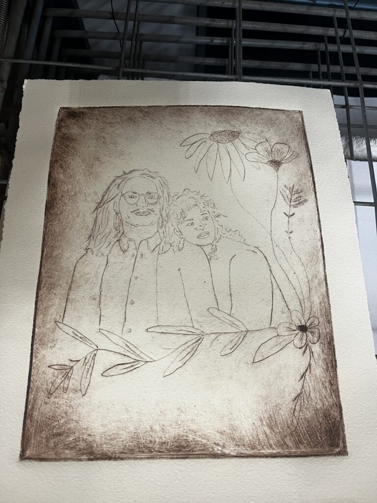
“10/18/25”-
my friends are getting married! portrait taken from their save the dates and added some floral elements. best wedding gift ever?
“some advice”-
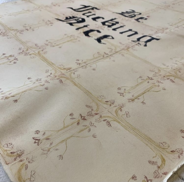
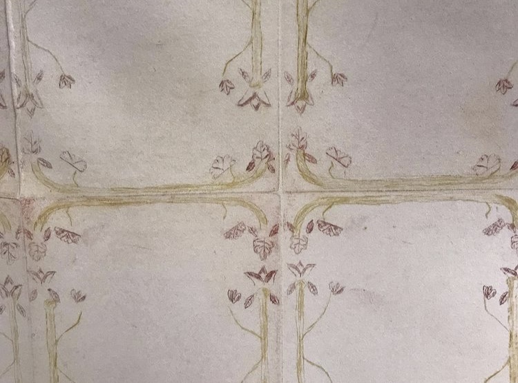
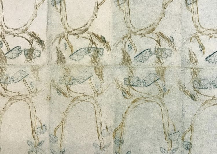
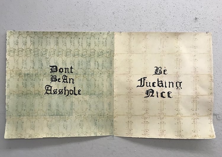
a commentary on the societal status and importance that the english country house had, versus today’s political and societal climate, especially now in a global pandemic and the fight for absolute racial equality. these two things seem entirely different but to me they suggest “a once was” versus “our now and future”, and the opposites that they reflect. the english country house was a symbol of status, wealth, and power in England up until the start of the 20th century, and the words of empathy remark on how far we have strayed from empathy, education on other people’s perspective, and the rise of ignorance. these ideas are reflected in the imagery and the text chosen. the imagery is a call back to what motifs were popular in the Elizabethan and Jacobean eras, floral elements allude to a certain elegance that would have appealed to the aristocracy at the time. juxtaposed, the bold black letter of the screen print is heavy and turns the narrative into something else. the choice of medium is another aspect of this idea, in that copper plate etching and intaglio has been used for centuries, whereas screen printing in the way that we know of today is a relatively new form of printing, as well as being longed associated with DIY and subcultures throughout the 20th century. this closely follows my own thoughts on art and what it can mean to others. the text contains expletive language. however, this points out that art should not be censored and also that these messages need to be taken seriously, with the language used as emphasis. my work directly correlates to what is happening in the world in 2020, as tensions between groups rise and hatred is being spread more rapidly through the way of our leaders allowing it, in the same way the aristocracy in 18th century England had been a symbol of oppression to most of the population.
“apocalypse”-
first drypoint depicting a whimsical summer memory. A chateau in Angers, France that contains a 14th century tapestry, the largest set to survive from the medieval ages.

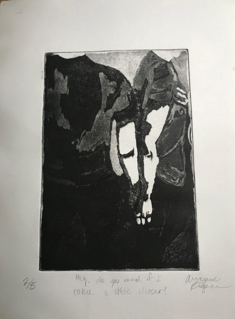
“hey, do you mind if i come a little closer?”-
first attempt at etching with aqua tint, depicting the queer experience in finding both platonic and romantic companionship.
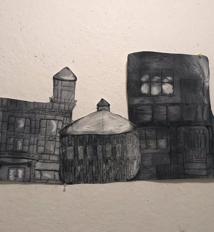
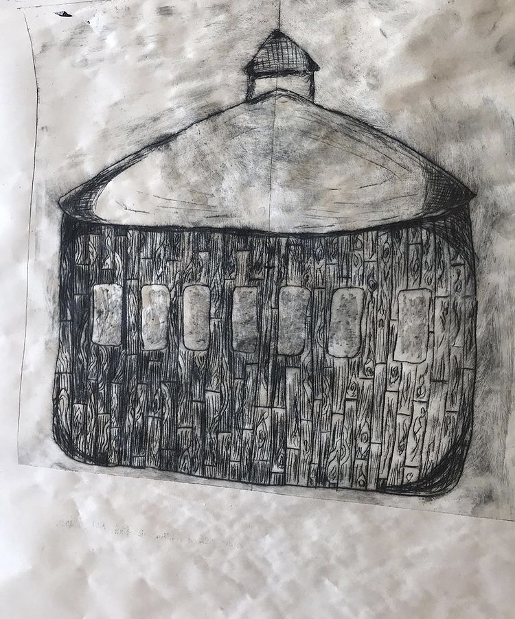
“5216 3200 1045 … “ –
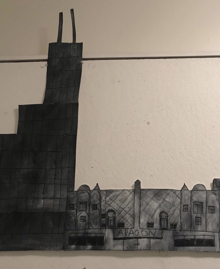
places have a part in how we view things and what we value, as well as being an integral part in family and how we view what a home is. it can shape us in how we want to live and influence every day life. the constant moving also helps us gain life experience, such as when one wants to travel and live in different areas, it helps us gain knowledge of the world around us but also a deeper understanding of ourselves and what we are like. these specific buildings helped me grow into who I am, and the timeline of when, and how often, they are in my life is important to me when in the context of how I came to be that person.

silkscreen
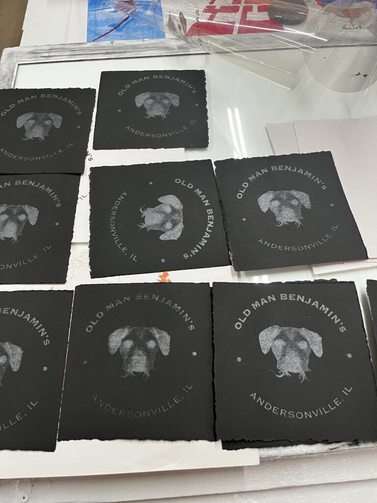
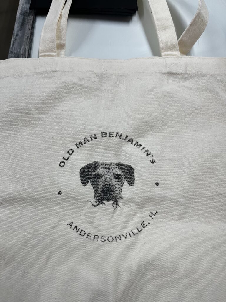
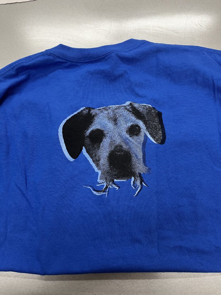
“benji” –
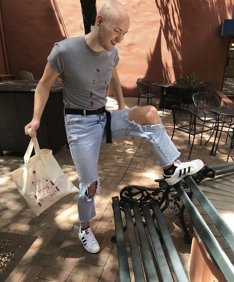
using photoshop and bitmaps, a portrait honoring my best friend was made, with his memory on t-shirts and tote bags forever.
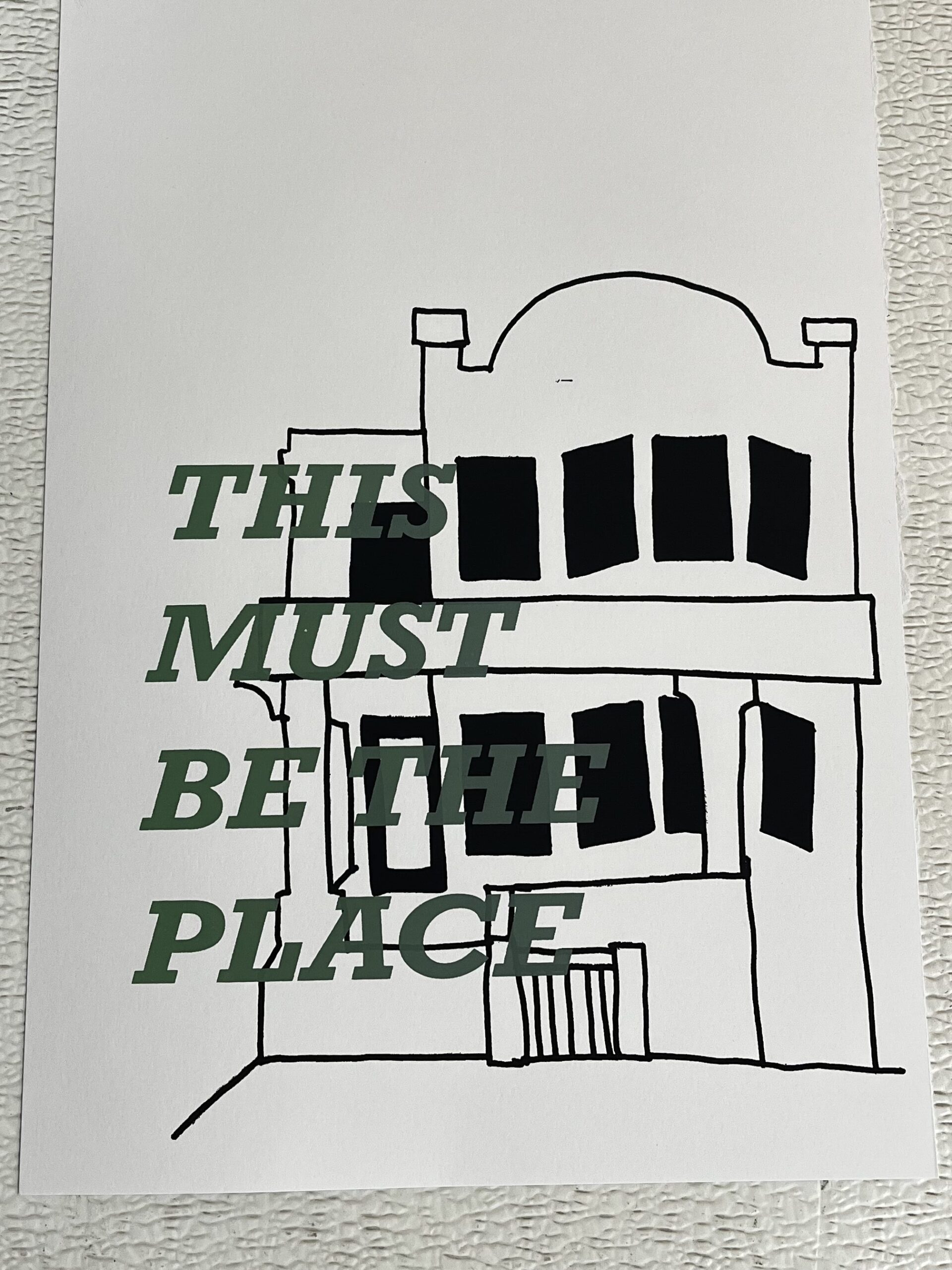
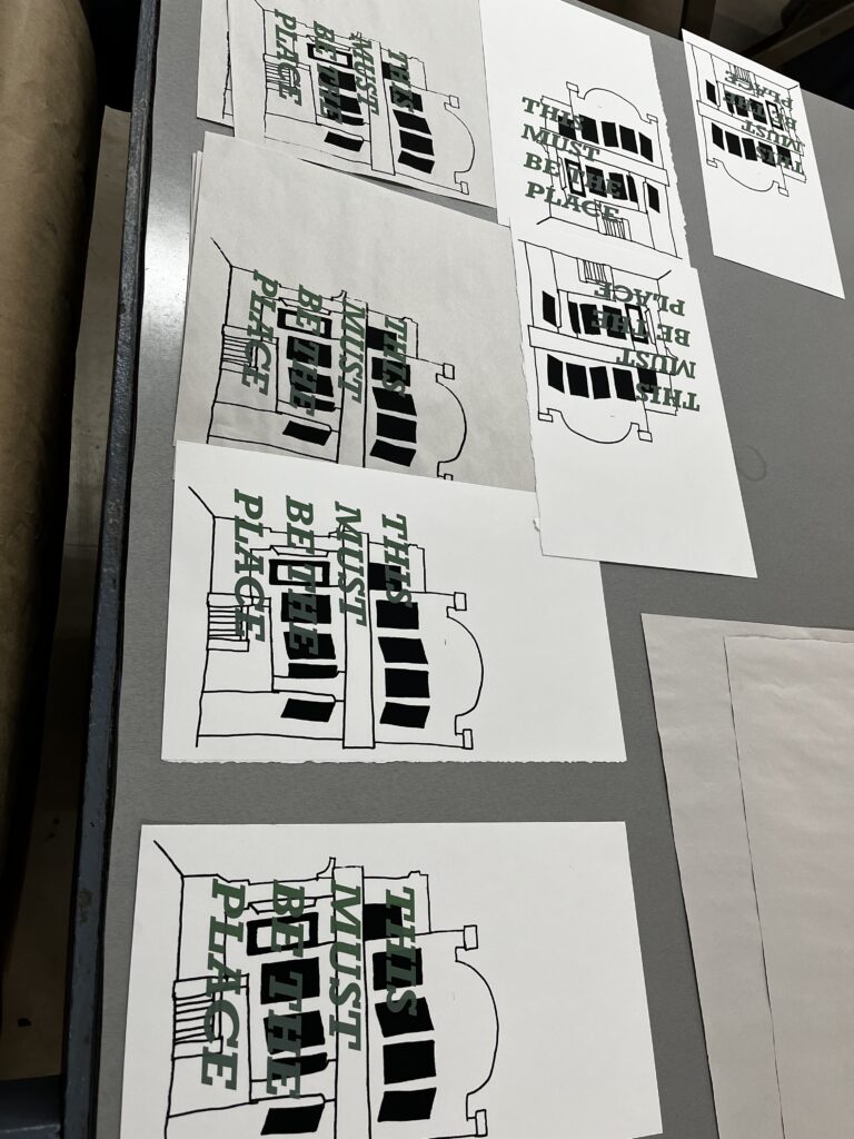
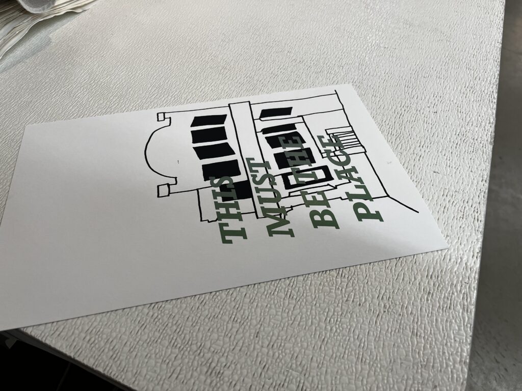
“this must be the place” –
using a split fountain, and playing with text and a simple line drawing, an homage to home was created.
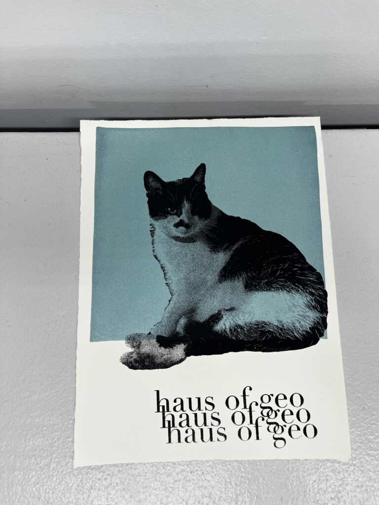
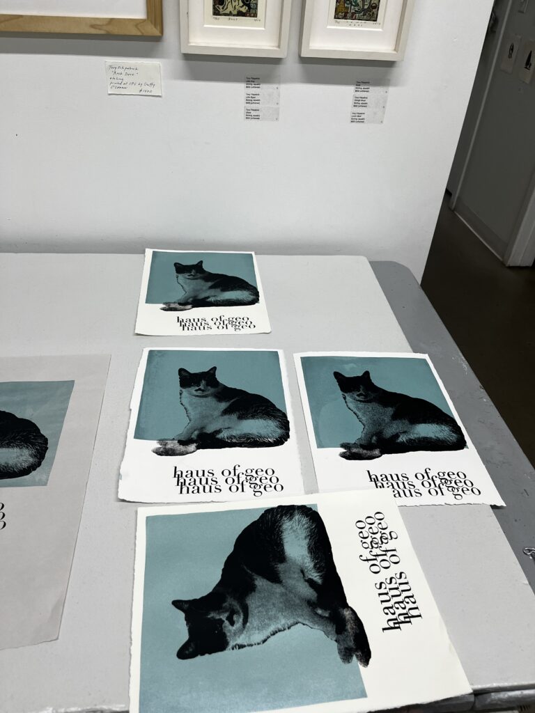
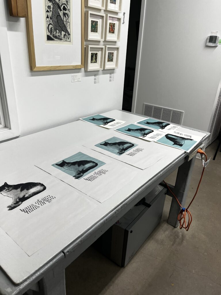
“haus of geo” –
for a friends birthday, a high fashion look into how their cat really feels.
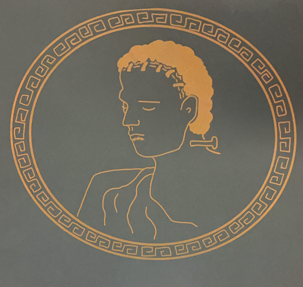
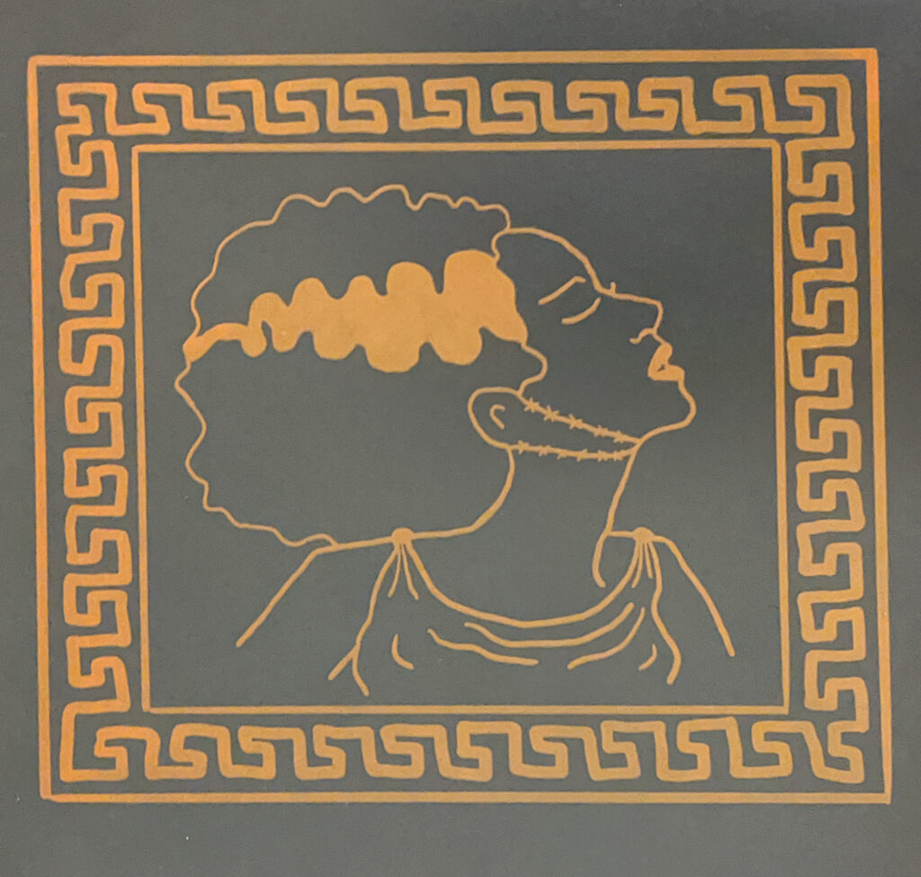
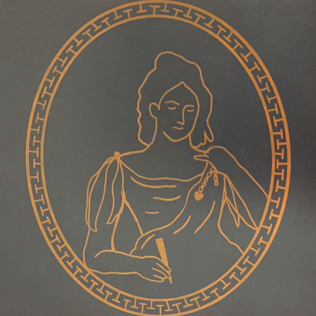
“the modern prometheus” –
a triptych based on Mary Shelley’s 1818 sci-fi novel, with Frankenstein’s monster, the bride, and Mary herself in classical Greek amphora style, referencing the novels subtitle.
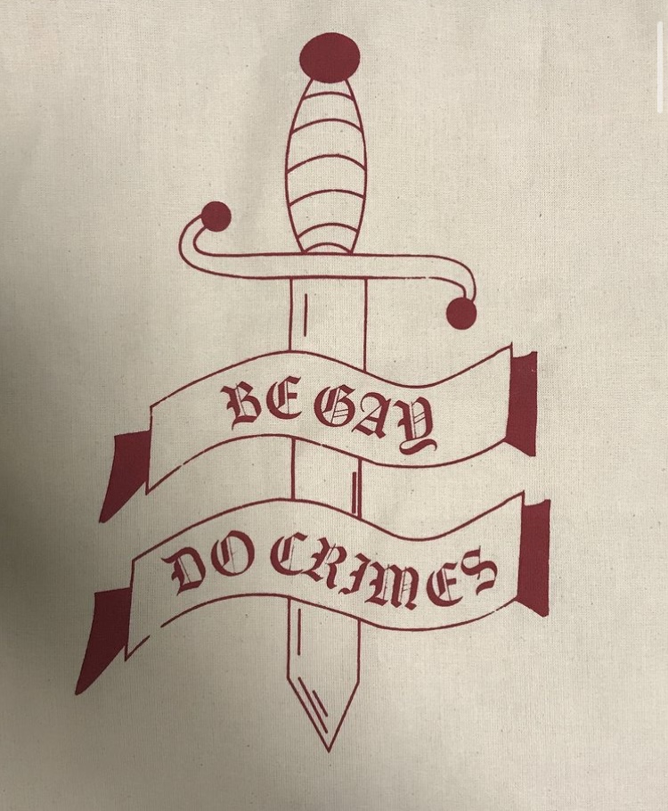
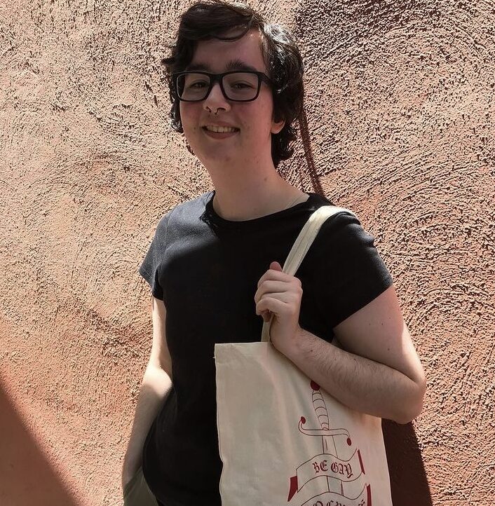
“happy pride month”-
small silk screen project that contains an ironic slogan for pride month, and being tired of big corporations just selling rainbows.
“exquisite corpse poem”-
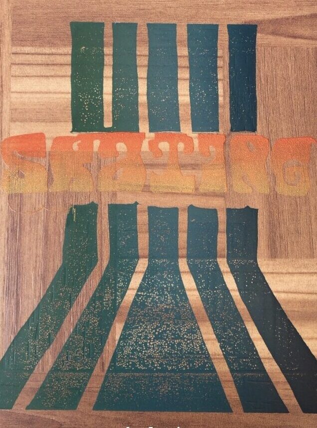
this was apart of a class wide exquisite corpse poem, in which i had the word “skating”. 70’s inspired graphics and typography, as well as two split fountains for both graphic components. printed on vinyl flooring (looked very cool, but i would advise to…not do that).
lithography
“self care tip #1”-
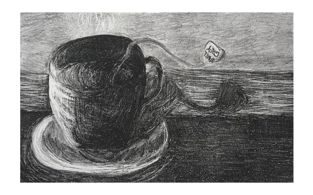
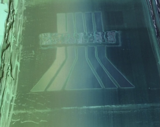
a journey through life with anxiety and some coping methods to ground oneself. a nice cuppa. first stone litho project, exploring how charcoal drawing and printmaking interact.
